Agency: Hero Digital
Client: Cord Blood Registry
UX + UI Design: Steven Ackerman
CBR client portal mobile optimization: simple transaction flow for expecting mothers
Cord Blood Registry’s client portal is a banking app. A blood banking app. The service allows new parents to preserve their baby’s newborn stem cells for a variety of potential future medical applications. The CBR marketing site had received a rebranded and responsive redesign. But the client portal, where a customer views their account status, had not.
Through a process of deconstruction, abstraction, and mobile-first re-architecting, I streamlined the mobile user flow, and updated the visual style. As a bonus, I drastically improved the desktop information architecture.
The problem
The client portal didn’t support mobile users. But it needed to. The user demographic showed a strongly increasing trend of mobile usage. The user persona demanded convenience.
She also needed to feel trust. An upgraded look-and-feel would help maintain end-to-end brand equity — critical to conveying trustworthiness and instilling confidence in the service.
The process
Abstraction is a process of deconstructing content and actions
I collected requirements, reviewed the technical constraints, and referenced the visual design source materials. Next, I deconstructed the content and user actions from the old design. From there, I consolidated and redefined their hierarchies.
Insights
We can’t always just apply responsive breakpoints to an existing desktop design, especially if the navigation is complex. Instead, a mobile-first perspective was required.
Principles
All facets of a section can be consolidated to a single page.
Accordion rows can progressively disclose details.
Information and inputs such as forms and dialogs can occupy modal overlays.
Benefits
Fewer pages for a more streamlined navigation
Prioritized content and actions for better usability
Progressive disclosure for reduced cognitive load
Modal overlays contextualize actions, create focus, and provide clear back-navigation
Progressive disclosure reduces cognitive load, eases perceived performance by lazy-loading
From there, I synthesized a new design that supported mobile users, and in the process of rethinking the tool's navigation from a mobile-first perspective, simplified the desktop experience as well.
The original configuration had 19 separate pages.
The mobile-first approach distilled it down to 3 pages.
Mobile Concept
I redesigned the screens and user flow based on the information architecture insights. I validated the interactions using clickable prototypes.


Documentation
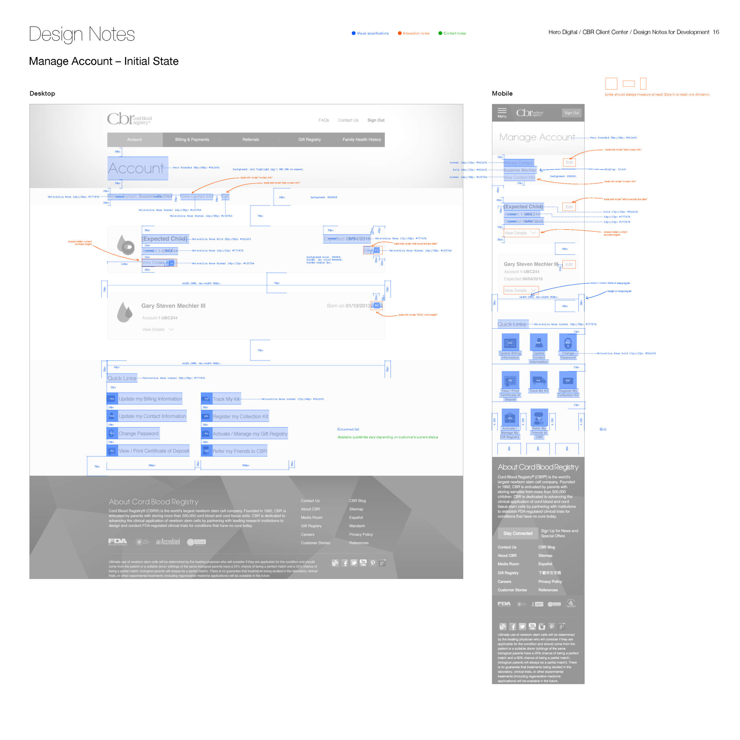
I documented the designs, explaining the recommendations and annotating its key features.


Build Specifications
I helped the devs out by annotating some of the key measurements needed to achieve the look and feel.


Results
Successes
The client has a clear path forward for refactoring their front-end portal for maximum usability and brand consistency.
Engineers were enthusiastic about the solution, and felt their needs had been accomodated for.
A mobile-first design approach improved desktop usability as well.