Company: Say Say K
UX + UI Design: Steven Ackerman
Product Manager: Ferris Hua
Lang Guo: master English watching TV you care about
Lang Guo (朗果) is a native app that helps advanced students of English hone their conversational skills and enhance their cultural fluency. You can save and categorize subtitles, look up and cross-reference vocabulary words, practice pronunciation and track your progress.
Who will benefit?
How we defined the end user changed significantly over the course of the project. Was it “everyone”? Business professionals? Children? And so on. With the help of some market research, we narrowed in on the target persona: a young adult in a first- or second-tier city, sometimes known as 国际范儿: an “international fan child”. Call her Jessica. This definition informed my competitive and comparative analysis, understanding of user context and needs, and even primary device form factor.
Our main market is young adults in a 1st/2nd-tier city, sometimes known as 国际范儿: “International fan child”
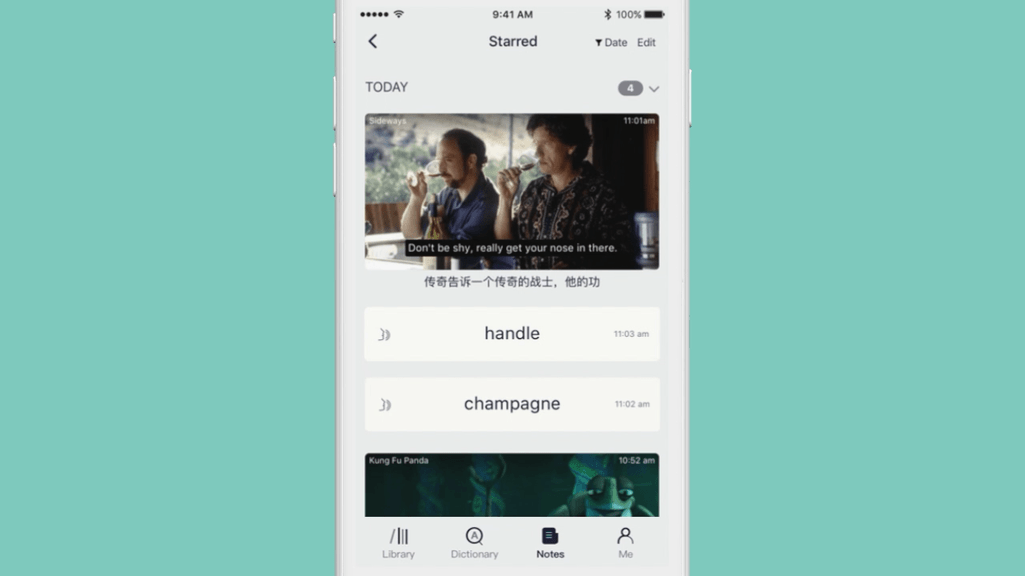
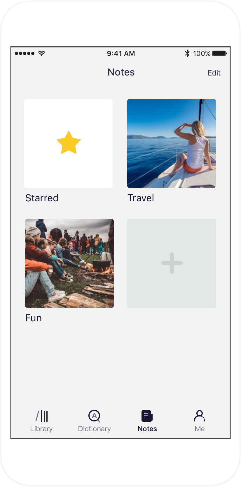
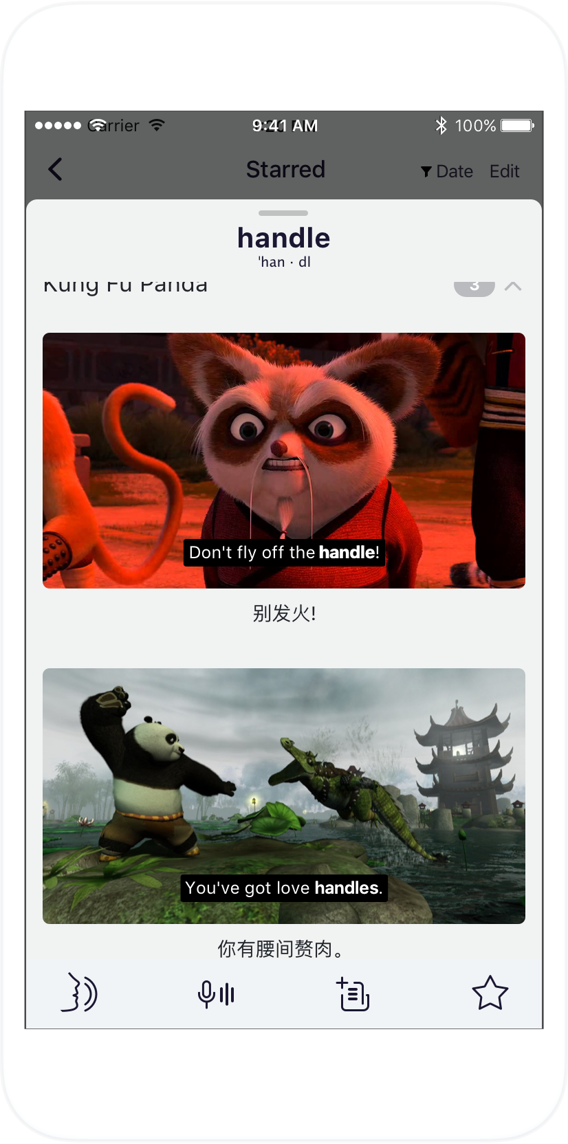
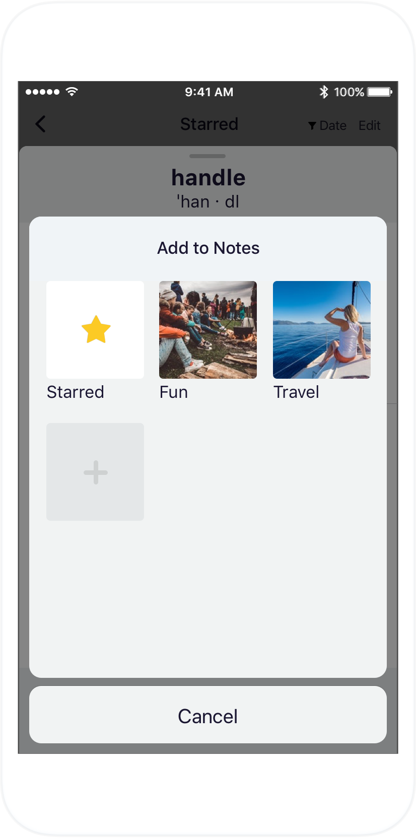
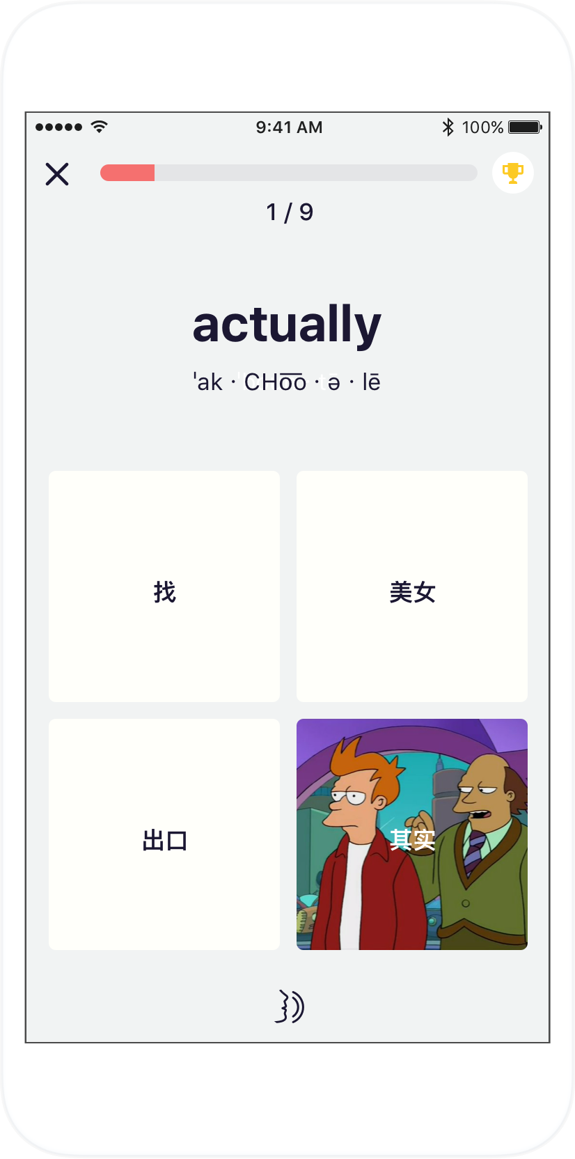
Interact with and collect subtitles
How does one interact with subtitles in a meaningful, entertaining and intuitive way? With a unique media player design that addresses these needs. It enables one to look up words in context and find additional usage examples. Users can then bookmark and categorize words and subtitles of interest.


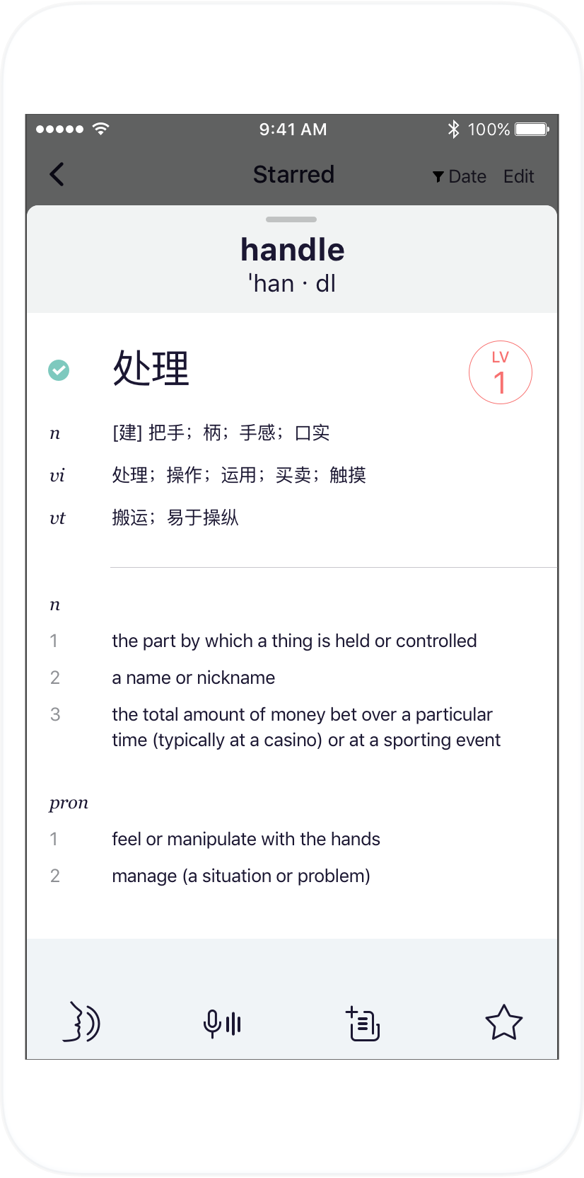
Browse related subtitles and words
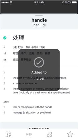
You look up a word to get translations, definitions and pronunciations. But here, you’ll also get other examples of its usage and pronunciation in context. What if from there you could look up another word from context, and get subtitles using that word? And so on?
Browsing this way is analagous to following hyperlinks on the web. You follow a fascinating trajectory of discovery. Eventually you reach an end point where you’ll want to go back. Sometimes that means regressing partway through the chain of discovery that led you here, but more often it means going all the way back to the point of origin. A unique modal card stack design enables this type of deep-dive exploration.
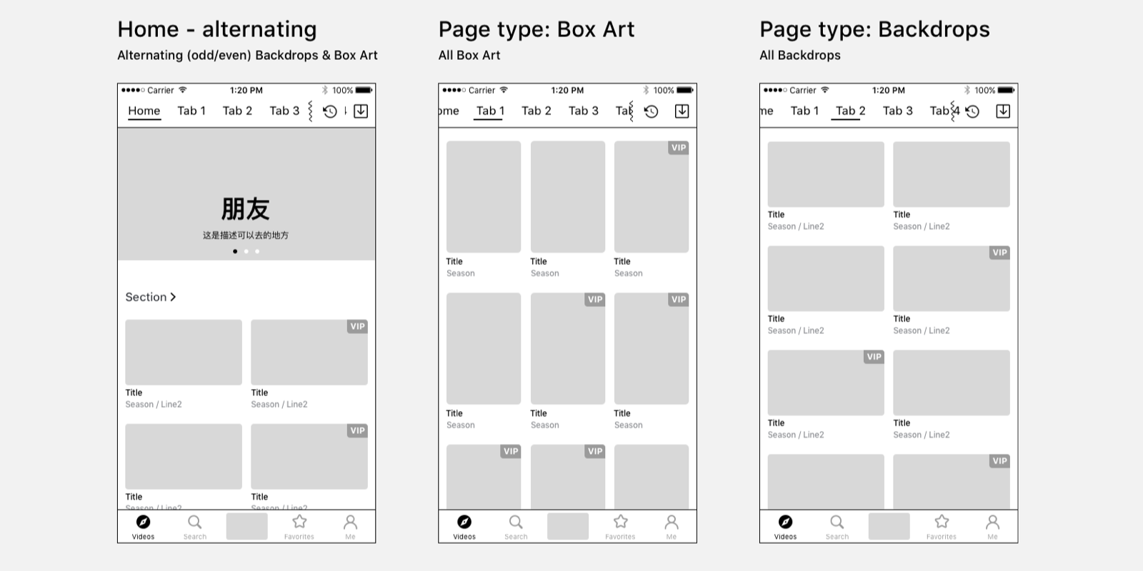
Discover content
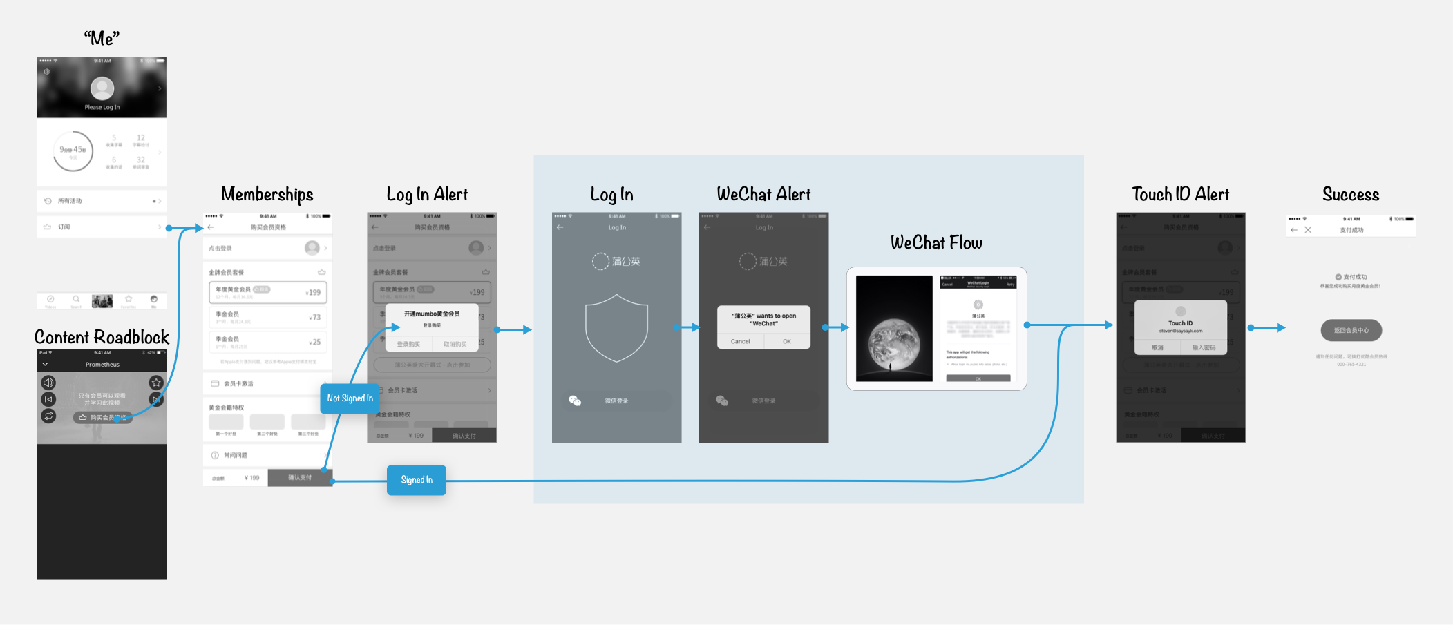
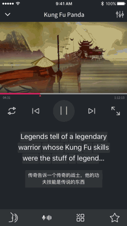
Users need an interface that is familiar yet tailored to the unique purpose of learning. I researched best practices in competitive and comparative experiences — especially those native to digital China — to synthesize a highly usable video browser. Because of how data rates and connectivity work in China, offline caching and file management was a crucial feature. Features relating to our user’s learning goals included language-level ratings, personalized level and interest matching, and recommended quizzes.


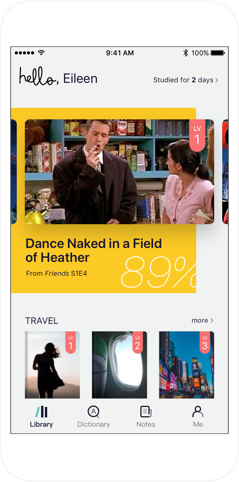


Practice pronunciation, take quizzes, and track progress
A modal experience for voice input and pronunciation scoring lets users engage in speaking practice. They can improve recall and level up in curriculum by taking brief, machine-generated, multiple choice quizzes. And they can track their engagement and learning progress on a personalized dashboard.


Agile Development
Design, product management and development worked closely in an agile scrum workflow to deliver and iterate on an MVP of the app. Design work involved researching competitive and comparative experiences, interviewing users, defining flows, authoring Jira specifications, prototyping and delivering specs and assets, and iterating with the front-end team.
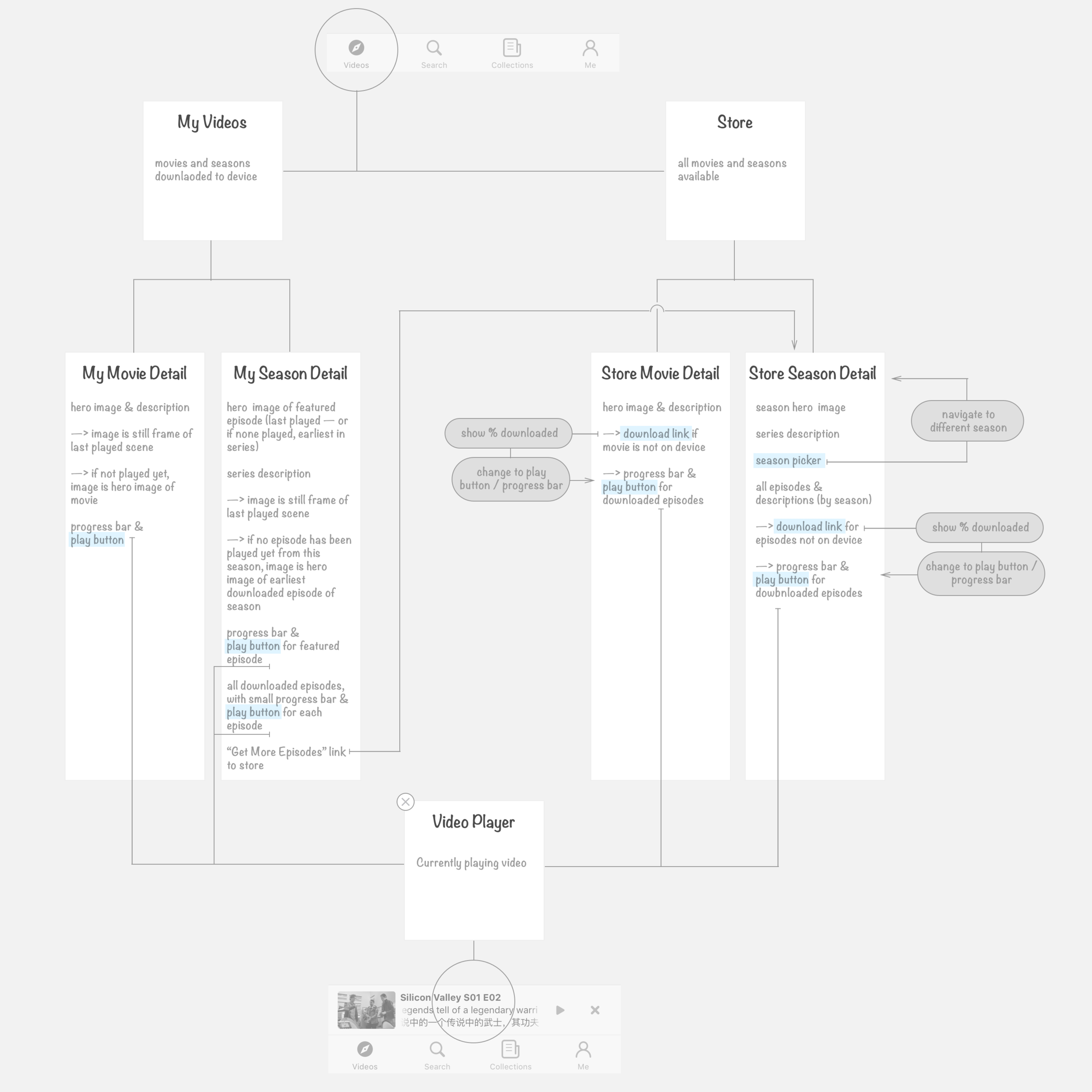
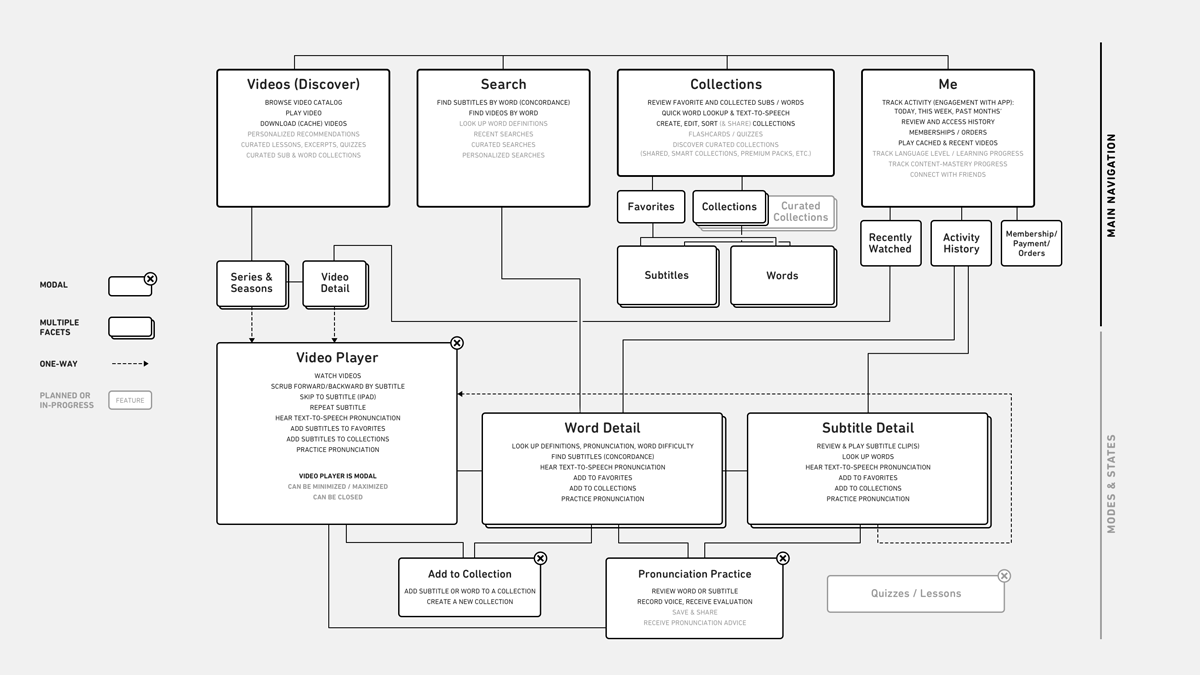
As feature lists grow, keeping track of the information architecture supports a shared understanding among stakeholders.
MVP Branding

The name Lang Guo (朗果) means "talking fruit". The working English name is Lyngo.
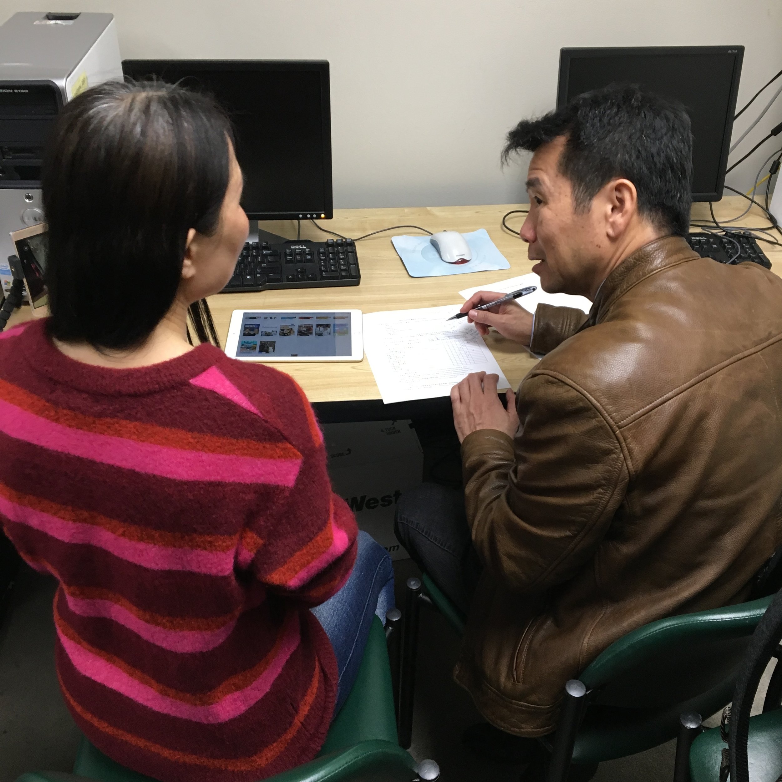
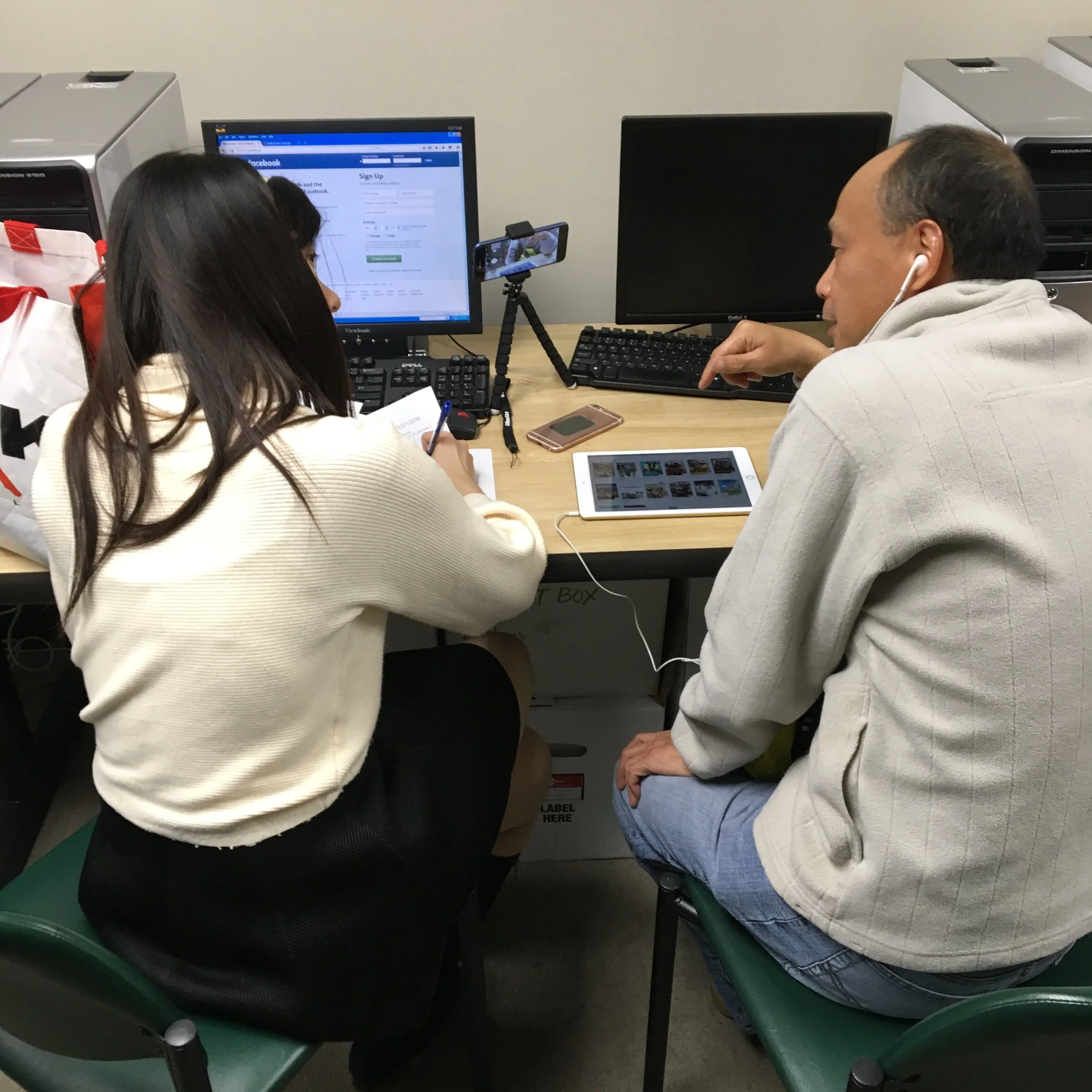
Testing
Friends and friends-of-friends were invited to the closed beta testing program. I gained many insights into usability and user needs from feedback we received through this kind of “hallway” testing.
We also formally engaged with local students of English through interviews and usability tests. The best discoveries are always those that are least expected.

Successes
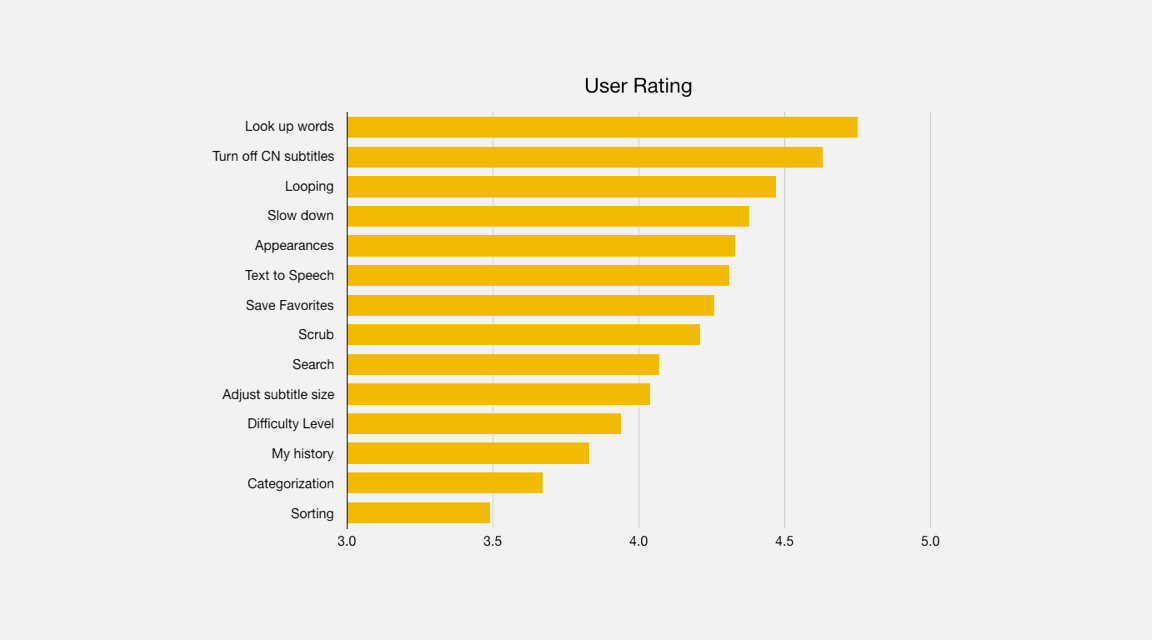
Subjects younger than 30 found the app easy to explore (older users were sometimes confused/hesitant)
Users found it easy to navigate the video library
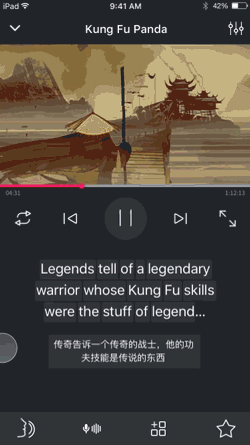
The tablet version’s video player subtitle navigation column
Word lookup
Capability to toggle CN subtites
Ability to resize subtitles was a unique feature
“Appearances of” seen as a killer feature
Pain Points
Tooltips were universally skipped past unread, resulting in poor heuristics for some basic features
Subtitles move too fast to interact with, some were unclear that they could jump to previous/next subtitles
Looping functionality was counterintuitive
Categorization: Feature was perceived as valuable, but users required guidance
Some icons presented significant confusion (e.g. Text-to-Speech button; Difficulty Level indicator)
Some users did not understand how to exit the word detail view
Users were unclear what would happen after they favorited a word or subtitle
UI/UX Improvements
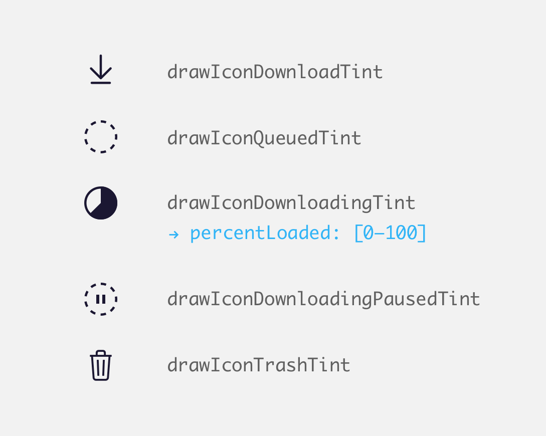
Optimize iconography
Test button labels
Allow easier toggling of Chinese subtitle
Implement contextual tooltips
Content + Feature Requests
Shorter content clips, videos relevant to daily use
Games
Improve dictionary quality
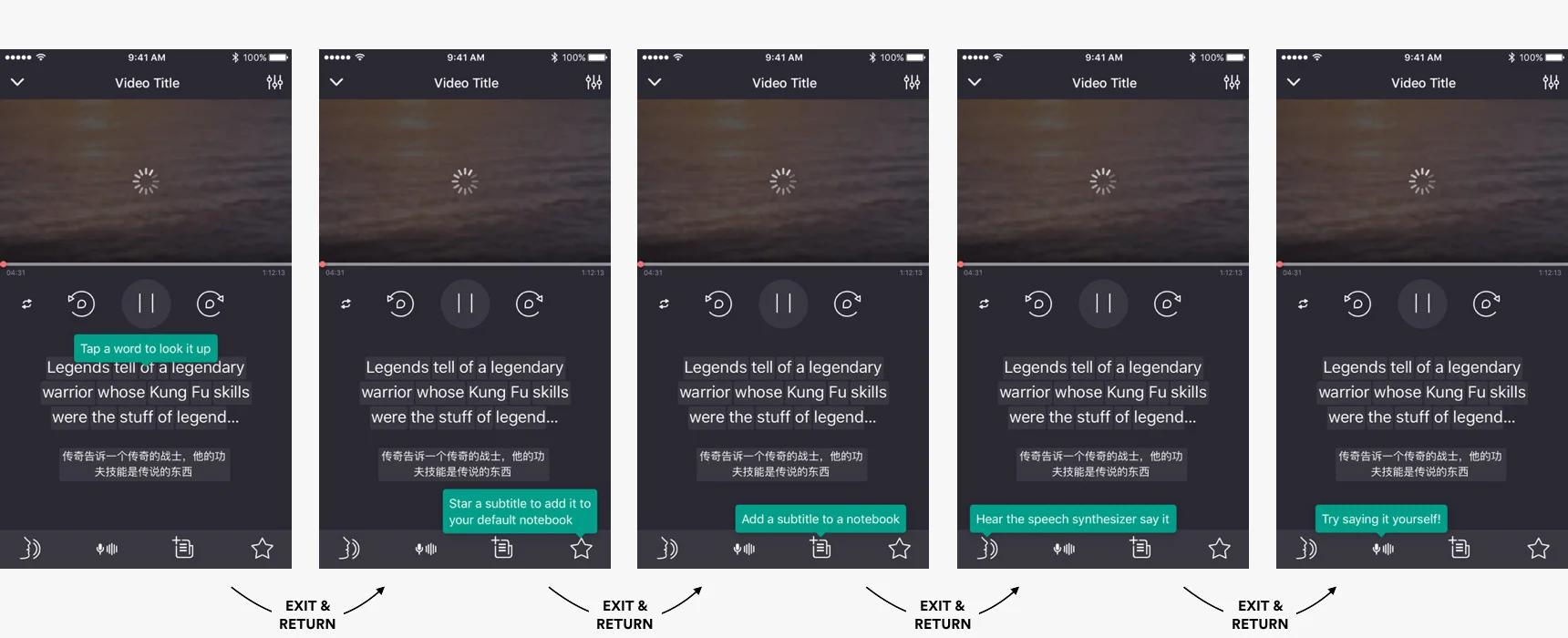
Distributing tooltips over time improved the heuristics
To improve usability, attention is brought to newly-saved notes using toast-style notifications, tooltips and badges.
Users needed a way to toggle the translation on-the-fly. Making the translation itself the toggle button made for a clean solution.
Animating the subtitles provided an affordance for, and reinforcement of, the pan gesture
Conclusion
The app achieved a level of usability and performance that made it a viable tool for the motivated learner. Ultimately, however, the success of the app will hinge on content, and the curation thereof. Video content will need to be relevant and well curated; and language content will need deep authoring that expresses overarching curricula.